Engagement trough gamification
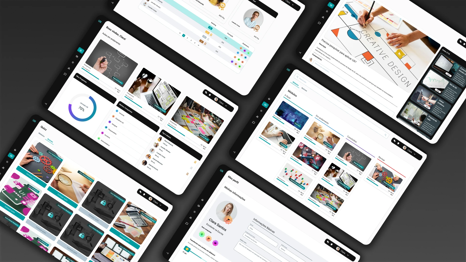
Gamified online learning platform
ROLE
UX/UI Designer
YEAR
2023
Project Description
How to make online learning more engaging and effective?
Our challenge was to increase student engagement and motivation without complicating navigation or overwhelming the experience. We wanted to create solutions that would truly make a difference in the user's daily life.
The problem
With the increase in online teaching platforms, studying remotely has become easier. However, alongside this convenience, challenges arise that affect students, teachers, and even those who invest in these platforms.
The problem is that many students end up giving up studying online, and this affects everyone: students, teachers, and even those who created the platform. They feel demotivated and cannot see progress in their studies. This happens because the platforms
Process
Competitor analysis
When analyzing competitors, it was possible to identify that none of the main competitors had the
feature of complete itinerary suggestions. It was concluded that this would be a great differentiator for
the application.
User research
To understand the needs, desires, and behaviors of users of a product, it is essential to
conduct User Research. By understanding users' needs, it is possible to create more effective
and satisfying solutions, which ultimately leads to a good user experience when using a
product or service.
our User
We created the persona Clara Santos, representing our main user: young professionals studying to change careers but facing difficulties in maintaining focus and motivation.
We mapped her journey to identify moments of demotivation, pain points in navigation, and opportunities for improvement that guided the entire design solution.

Clara Santos
"Online classes require a lot of focus; sometimes I come home from work very tired, so I need classes that capture my attention and are straightforward."
Age
29 years old
Profession
Graphic Designer
Marital Status
Single
Location
São Paulo, SP
FRIENDLY
AMBITIOUS
INDEPENDENT
Key Insights
Our analysis revealed a significant operational gap in the validation process. Employees were forced to navigate across multiple spreadsheets and system tabs just to complete a single task. This fragmented experience led to inefficiencies, increased cognitive load, and a higher risk of human error.
Solution
The proposed solution was a gamified system: students earn points by completing modules, quizzes, and practical activities, which they can redeem for benefits such as discounts on courses.
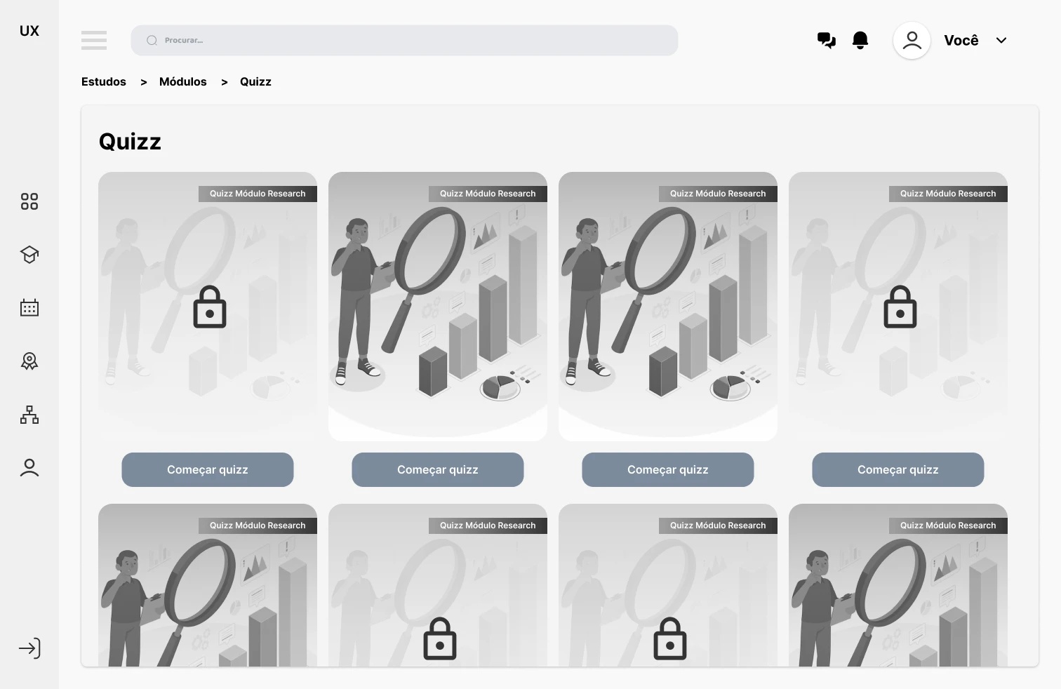
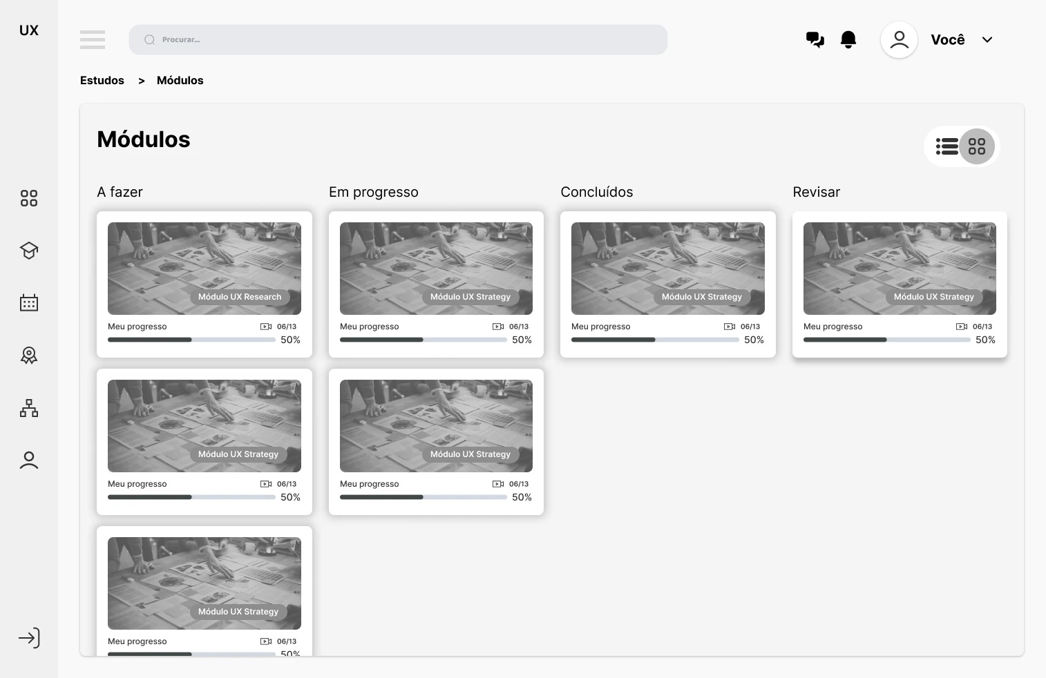
We developed medium-fidelity wireframes in Figma to validate navigation, interactions, and flow before moving on to high-fidelity prototypes.
Wireframe:
Usability Test
We conducted a usability test with the medium-fidelity prototype of our platform.
While analyzing the tests of our users interacting with the platform, we identified areas for improvement
and refined the navigability.
9
Users
5
Task complete
1
Task was too hard
After analyzing the results of the usability test, it became clear that we needed to improve the visibility of the chat with friends, We realized that this feature was fundamental for user interaction and community growth within the platform.
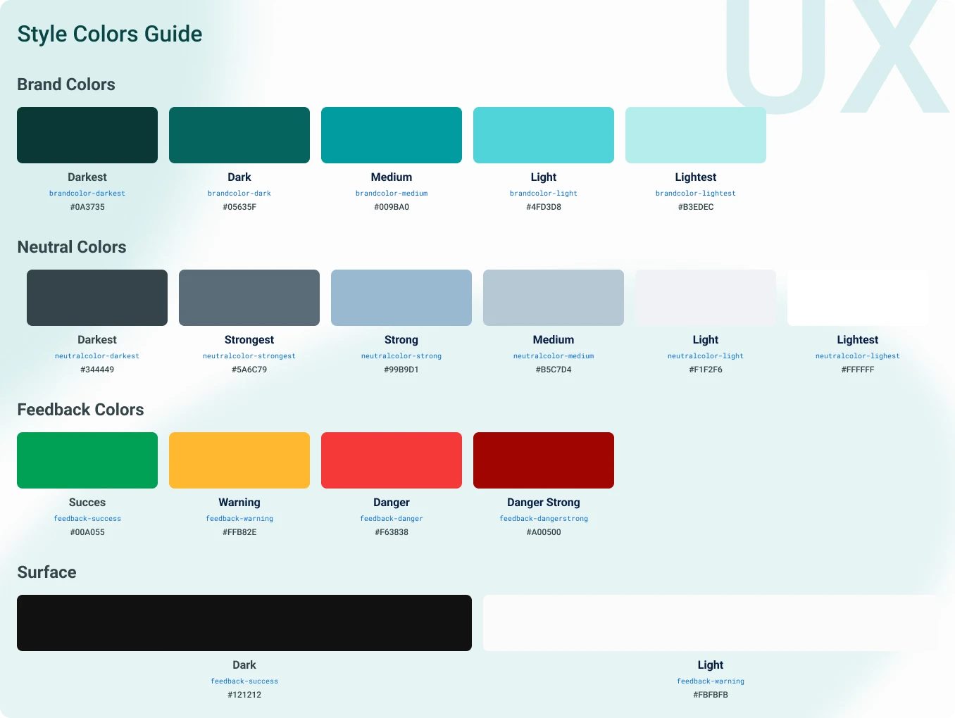
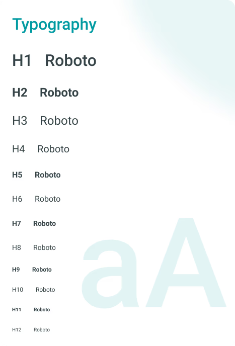
Style Guide
The Style guide is an essential tool for maintaining brand consistency, improving design efficiency, and
providing an intuitive and high-quality user experience. It serves as a map that guides all visual aspects,
being a vital element for designers.
Conclusion
After completing this case study, I can see how much I have developed by working in a team, enhancing essential skills such as communication and task division, as well as evolving in all aspects of the UX field.
Visit the website at www.nutrior.io
JULIO UX
Product Designer | UX/UI Designer
Navigation
Home
Contact
Case studies
Toll validation system
Jornada UX
Nutrir.io
Social media
© 2025 – Júlio Costa
Engagement trough gamification
Gamified online learning platform
ROLE
UX/UI Designer
YEAR
2023

Project Description
How to make online learning more engaging and effective?
Our challenge was to increase student engagement and motivation without complicating navigation or overwhelming the experience. We wanted to create solutions that would truly make a difference in the user's daily life.
The problem
With the increase in online teaching platforms, studying remotely has become easier. However, alongside this convenience, challenges arise that affect students, teachers, and even those who invest in these platforms.
The problem is that many students end up giving up studying online, and this affects everyone: students, teachers, and even those who created the platform. They feel demotivated and cannot see progress in their studies. This happens because the platforms
Process
Competitor analysis
When analyzing competitors, it was possible to identify that none of the main competitors had the
feature of complete itinerary suggestions. It was concluded that this would be a great differentiator for
the application.
User research
To understand the needs, desires, and behaviors of users of a product, it is essential to
conduct User Research. By understanding users' needs, it is possible to create more effective
and satisfying solutions, which ultimately leads to a good user experience when using a
product or service.
our user
We created the persona Clara Santos, representing our main user: young professionals studying to change careers but facing difficulties in maintaining focus and motivation.
We mapped her journey to identify moments of demotivation, pain points in navigation, and opportunities for improvement that guided the entire design solution.
Clara Santos

Age
29 years old
Profession
Graphic Designer
Marital Status
Single
Location
São Paulo, SP
FRIENDLY
AMBITIOUS
INDEPENDENT
"Online classes require a lot of focus; sometimes I come home from work very tired, so I need classes that capture my attention and are straightforward."
Key Insights
Our analysis revealed a significant operational gap in the validation process. Employees were forced to navigate across multiple spreadsheets and system tabs just to complete a single task. This fragmented experience led to inefficiencies, increased cognitive load, and a higher risk of human error.
Solution
After gathering valuable information through research and in-depth analysis, we realized that to keep the student motivated until the end of the course, a reward system would be welcome.
For each completed module, for each quiz answered, and for each case delivered, the student earns a
predefined amount of points. When the student finishes the course, they will be able to exchange the points and claim money back , once they reach the goal of 1000 points.
Wireframe:


Usability Test
We conducted a usability test with the medium-fidelity prototype of our platform.
While analyzing the tests of our users interacting with the platform, we identified areas for improvement
and refined the navigability.
9
Users
5
Task complete
1
Task was too hard
After analyzing the results of the usability test, it became clear that we needed to improve the visibility of the chat with friends, We realized that this feature was fundamental for user interaction and community growth within the platform.
Style Guide
The Style guide is an essential tool for maintaining brand consistency, improving design efficiency, and
providing an intuitive and high-quality user experience. It serves as a map that guides all visual aspects,
being a vital element for designers.


Conclusion
After completing this case study, I can see how much I have developed by working in a team, enhancing essential skills such as communication and task division, as well as evolving in all aspects of the UX field.
Visit the website at www.nutrior.io
JULIO UX
Product Designer | UX/UI Designer
Navigation
Home
Contact
Case studies
Toll validation system
Jornada UX
Nutrir.io
Social media
© 2025 – Júlio Costa