User-centered design elvating the productivity
Validation of transits at Brazilian tolls
ROLE
UX Designer
YEAR
2024

Project Description
Our client, one of the largest highway companies in Brazil, aimed to increase the production of traffic validations at its toll plazas, and the team did it perfectly.
We increased up to 150% of general production velocity and 800% at violation cases.
Background
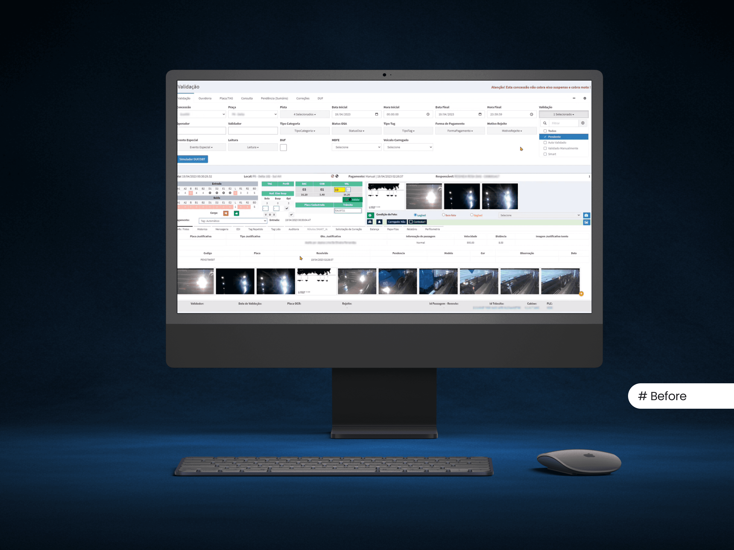
While automatic toll systems offer seamless convenience to drivers, the backend operations involve a complex validation process managed by a dedicated team. My role in this project was to redesign the internal validation interface used by operators—transforming an outdated, fragmented workspace into a modern, customizable, and visually intuitive tool. The goal was to streamline workflows, reduce cognitive load, and significantly improve operational efficiency.
Process
You can check here all the steps we took to finding the real problems.
Benchmarking
To accelerate our discovery process, we leveraged internal references from previous projects. These existing patterns gave us an initial understanding of how similar validation flows had been approached, helping us identify early opportunities and limitations.
User & Stakeholder Research
To ensure the solution was grounded in real user needs and business expectations, we conducted a series of qualitative interviews.
Employee Interviews
We interviewed 4 employees directly involved in the validation workflow. This exploratory research aimed to uncover pain points, inefficiencies, and unmet needs within their daily tasks. The insights gathered were instrumental in surfacing key usability issues and informed the early stages of ideation.
Stakeholder Interviews
In parallel, we interviewed 2 key stakeholders. These conversations were focused on understanding their strategic goals and expectations for the product. This alignment helped bridge user needs with business objectives, ensuring we were designing for both operational efficiency and measurable impact.
Analysis
Following the interviews, we dedicated time to map the current user flow and visualize the end-to-end experience using a service blueprint. This allowed us to holistically understand how different touchpoints connected, identify friction areas, and assess which parts of the process were working well versus those that required improvements.
Key Insights
Our analysis revealed a significant operational gap in the validation process. Employees were forced to navigate across multiple spreadsheets and system tabs just to complete a single task. This fragmented experience led to inefficiencies, increased cognitive load, and a higher risk of human error.
Solution
The insights uncovered during our research guided us toward a clear objective: consolidate the fragmented validation process into a single, streamlined interface that would enhance focus, minimize friction, and significantly improve efficiency.
With that vision in mind, we began by developing low-fidelity wireframes to explore potential solutions. This approach allowed us to rapidly iterate and validate core ideas with users before investing in high-fidelity visuals. By grounding our concepts in usability best practices from the start, we ensured the design was intuitive, goal-oriented, and aligned with both user needs and business priorities.
Wireframe:
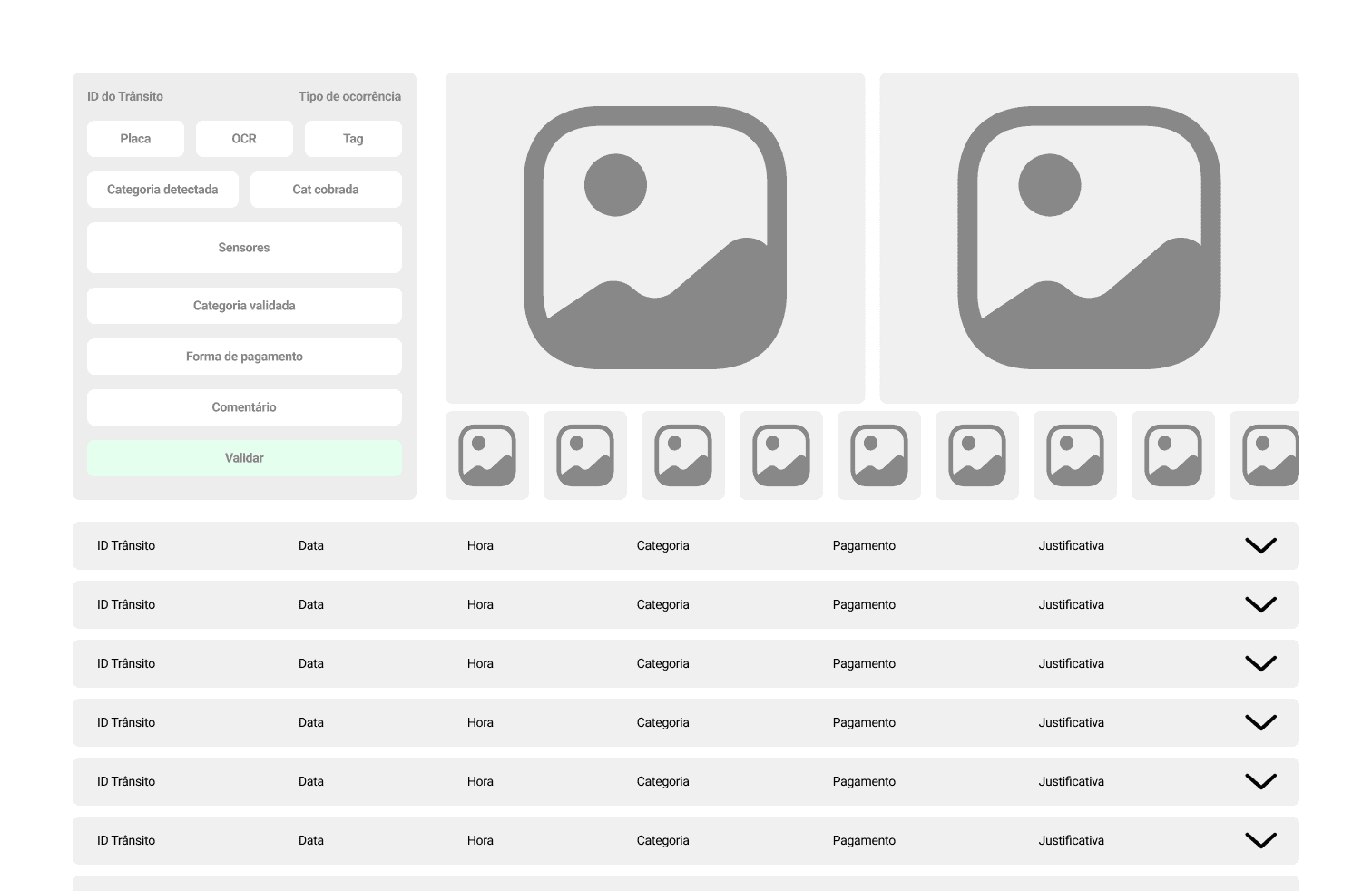
Key Solution
While every design decision contributed to the overall outcome, the most impactful was the introduction of expandable rows, each representing a separate transit case. This approach allowed users to access all relevant data in a compact, on-demand format without context-switching or navigating across multiple screens. By centralizing information and simplifying access, this change directly addressed the productivity bottlenecks and significantly improved task efficiency.
Design Decisions
Beyond the expandable table, we made several intentional design choices to enhance usability and streamline the operator’s workflow:
Consolidated Action Panel: Key actions were grouped in a fixed card on the left side of the interface, ensuring operators had quick, consistent access without scanning the entire screen.
High-Resolution Vehicle Images: We placed large, high-quality vehicle images at the top of the interface to support faster visual analysis and reduce decision-making time.
Keyboard Shortcuts: To further streamline repetitive tasks, we introduced customizable keyboard shortcuts. This empowered operators, who often perform the same actions dozens of times per day, to configure shortcuts that matched their personal workflows, significantly increasing speed and reducing fatigue.
Advanced Custom Filters: Our research revealed that operators follow specific patterns week over week. To support this, we designed an advanced filtering system that allows users to save their custom filter configurations and execute complex queries with a single click, eliminating repetitive manual inputs.
Each visual and interaction detail was crafted to reduce cognitive load, increase clarity, and support high-speed operations, crucial factors for a productivity-driven solution.


Results
The positive outcomes were only possible after iterating through two rounds of usability testing with real users. As expected, each session surfaced valuable feedback that led to targeted adjustments, refinements that ensured the solution was not only functional but genuinely aligned with user needs.
Increased Productivity
As expected with the introduction of a redesigned interface and new features, there was an initial learning curve. Some users took slightly longer to adapt to the updated visual structure and interaction patterns. However, once familiarized, the impact on their workflow was substantial, task execution speed went from 3.000 - 5.000 per day to 9.000 - 11.000, it increased by up to 150%. The violation tasks execution was drasticaly increased, from 320 per day to 2.880!
This measurable gain validated our design decisions and confirmed that investing in a more focused, customizable, and intuitive interface not only improved the user experience but also delivered significant operational efficiency.